
The Challenger
The Challenger takes fitness competition to the next level by using a standardized scoring system called the Challenger Score. It allows users of all ages, body types, and genders to compete on the same leaderboard. Users can track their fitness levels with scorecards and compare them against others. They can also join teams to push each other further in their workouts. The app hosts online fitness events for beginners, amateurs, and professionals, creating a competitive environment that motivates users to improve and aim for the top
Role
Product Design Lead
Year
2025
Platforms
Web App
Industry
Fitness
Task
As the UX/UI design lead for The Challenger Co., I was responsible for designing intuitive task flows for using the app, including joining teams and participating in fitness events. I focused on creating easy-to-use features that allow users to track their progress effectively while training. I also designed systems to report user performance, providing clear insights and opportunities for improvement. Additionally, I ensured that the app allows users to enter events appropriate to their fitness levels. I translated the app across Desktop, Mobile, and Tablet, ensuring a seamless and consistent experience on all platforms.

Design Process

UX Research
Research was the initial phase of this project. After several meetings with the client, I conducted in-depth research on fitness applications to understand their structure, user experience patterns, and market expectations. Although this app focused on a scoring-based system which set it apart from most fitness apps, it still needed to align with key fitness app standards. My research highlighted essential features such as core activity tracking, personalization, motivation, and community engagement, which became foundational in shaping the app’s UX strategy
Data Collection Criteria
Another key focus of this app was effective data collection. Through my research, I discovered that most fitness apps depend heavily on quantitative and biometric data. Therefore, my initial approach centered on designing the onboarding and usage flow in a way that would seamlessly gather relevant analytics. This data would later play a crucial role in refining and improving the overall product experience.


Persona
The next step in the process was understanding the users of the web application. This stage was relatively straightforward, as the client had already gathered valuable insights from previous fitness events that helped identify potential users. Using this information, I developed a user persona to represent the primary user group. This persona served as a foundation for mapping user flows, defining goals, and ensuring the app experience aligned with user needs and motivations.


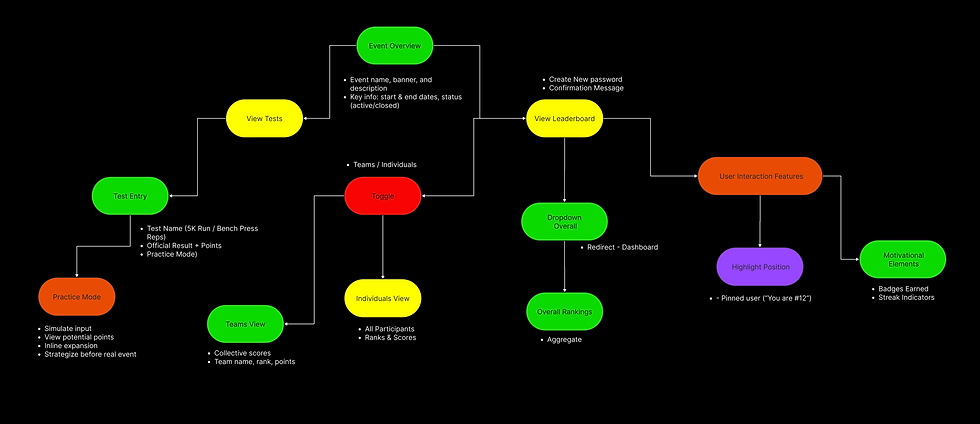
User Flows
All the research gathered up to this stage informed the development of the user flows. These flows were organized into five key pathways: Onboarding, Dashboard, Events, Teams, and User Profile. Each flow had its own specific goals while remaining interconnected to define the overall app experience and ensure users could achieve their objectives seamlessly.
UI Reference
The client had initially referenced specific visual styles and graphics as inspiration for the look of The Challenger, primarily drawing from Cyberpunk and FIFA UI design. Keeping these references in mind, I gathered additional visual assets that aligned with the established visual precedent. Together with the client, we reviewed these assets to identify what resonated and what did not. This stage was crucial for establishing the visual direction and laying the foundation for the UI design of the web application.
_page-0001.png)
UI Moodboard
I developed a comprehensive moodboard to establish the visual identity of the application while remaining aligned with the client’s references. This moodboard guided key UI decisions, including the color palette, typography, iconography, and layout structure. It also helped set the overall tone and mood of the interface, ensuring a cohesive and engaging user experience across all screens.

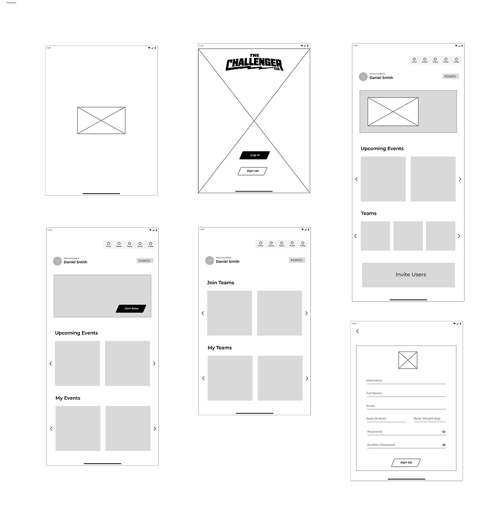
Wireframes
Based on the research insights and findings, I began wireframing the application and establishing the core components and assets. This stage was crucial in defining the app’s foundational design system, ensuring visual consistency across all layouts and seamless transitions between desktop, mobile, and tablet experiences.


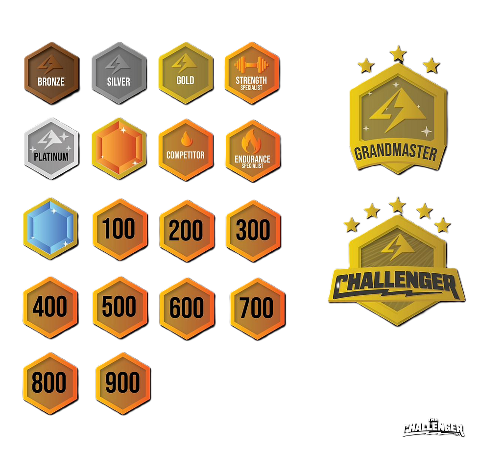
Components
Once the UI layout was established, the next step was to apply the design style to the components used throughout the application. This included adapting and resizing components for Desktop, Mobile, and Tablet screens while ensuring consistency and visual hierarchy across all platforms. A key focus was creating responsive components that could adjust seamlessly to different screen sizes through dimension changes alone, without altering the overall design style or visual identity of each element.

Calculate

Nav Bar
Button A

Score Cards
Event
Add
Button B
Badges
Background
Points

Banner
Active/Inactive


Prototype
For the final prototype of The Challenger, I refined the visual and interactive details to bring the product to life. Using the established design system, I focused on creating a seamless user experience that aligned with the client’s vision and user expectations. The prototype showcased how the interface elements, transitions, and interactions worked together to deliver a smooth and engaging flow across desktop, mobile, and tablet. This stage was essential in validating the design’s usability, visual consistency, and overall product feel before moving into development.
Desktop

Mobile


Tablet

Desktop

Mobile

Tablet
Discover More


