Capitl
Capitl is a digital exchange and payment platform that allows users to transform their retail loyalty points into cryptocurrency. These can then be converted to rands and used for secure, cashless transactions at any physical and online stores.
Role
Product Design Lead
Year
2025
Platforms
Mobile App
Industry
Cryptocurrency
Task
I was tasked with designing the complete UX/UI for Capitl, a platform focused on delivering a seamless and transparent digital payment experience while meeting South Africa’s financial regulations. The goal was to create an intuitive, secure, and user-friendly interface that inspires trust.
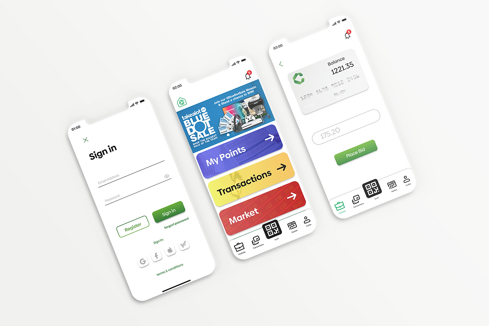
The design began with a simple onboarding flow, followed by a dashboard showing real-time balances, exchange rates, and detailed transaction insights. Users can make payments via QR code for in-store purchases or through secure online transactions.
Security features such as two-factor authentication were integrated for user protection. The UI follows a clean, modern aesthetic with a trust-driven color palette, intuitive icons, and smooth micro-interactions for a frictionless user experience.

Design Process

UX Research
Research was the foundation of this project, focusing on understanding both the real-world financial regulations and user behaviors surrounding retail loyalty programs. The goal was to identify user pain points, motivations, and goals when engaging with these programs. The key advantage of Capitl was its seamless conversion process, transforming loyalty points into Capitl currency and then into Rand, removing the limitation of spending points only at specific retailers. My research process involved conducting user interviews and surveys to gather real-time insights into user behavior and their overall experience with loyalty point systems.


User Flows
From the UX research, I created detailed user flows aimed at eliminating common user pain points and ensuring a seamless experience across the app. The flows mapped out each step of the user journey from onboarding, account verification, and login to managing transactions and viewing balances. Each flow was designed to minimize friction, guide users intuitively, and maintain a strong sense of trust and transparency throughout their interaction with the platform.

Wireframes
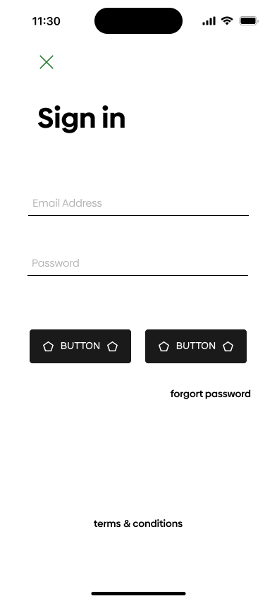
Based on the research insights and findings, I began wireframing the application and establishing the core components and assets. This stage was crucial in defining the app’s foundational design system, ensuring visual consistency across the entire app.


Prototype
Once the UI layout was established, the design style was applied consistently across all components used within the mobile application. Components were adapted and resized specifically for mobile screen constraints, ensuring clarity, usability, and a strong visual hierarchy. A key focus was on designing responsive mobile components that adapt seamlessly to different device sizes through proportional dimension adjustments, while maintaining a consistent design language and visual identity across the application.


Discover More


